ANA ASCH
![]()
PURPOSE MADE VISIBLE
Creative Direction // Brand Strategy // Visual Identity // Packaging
A brand refresh for growth:
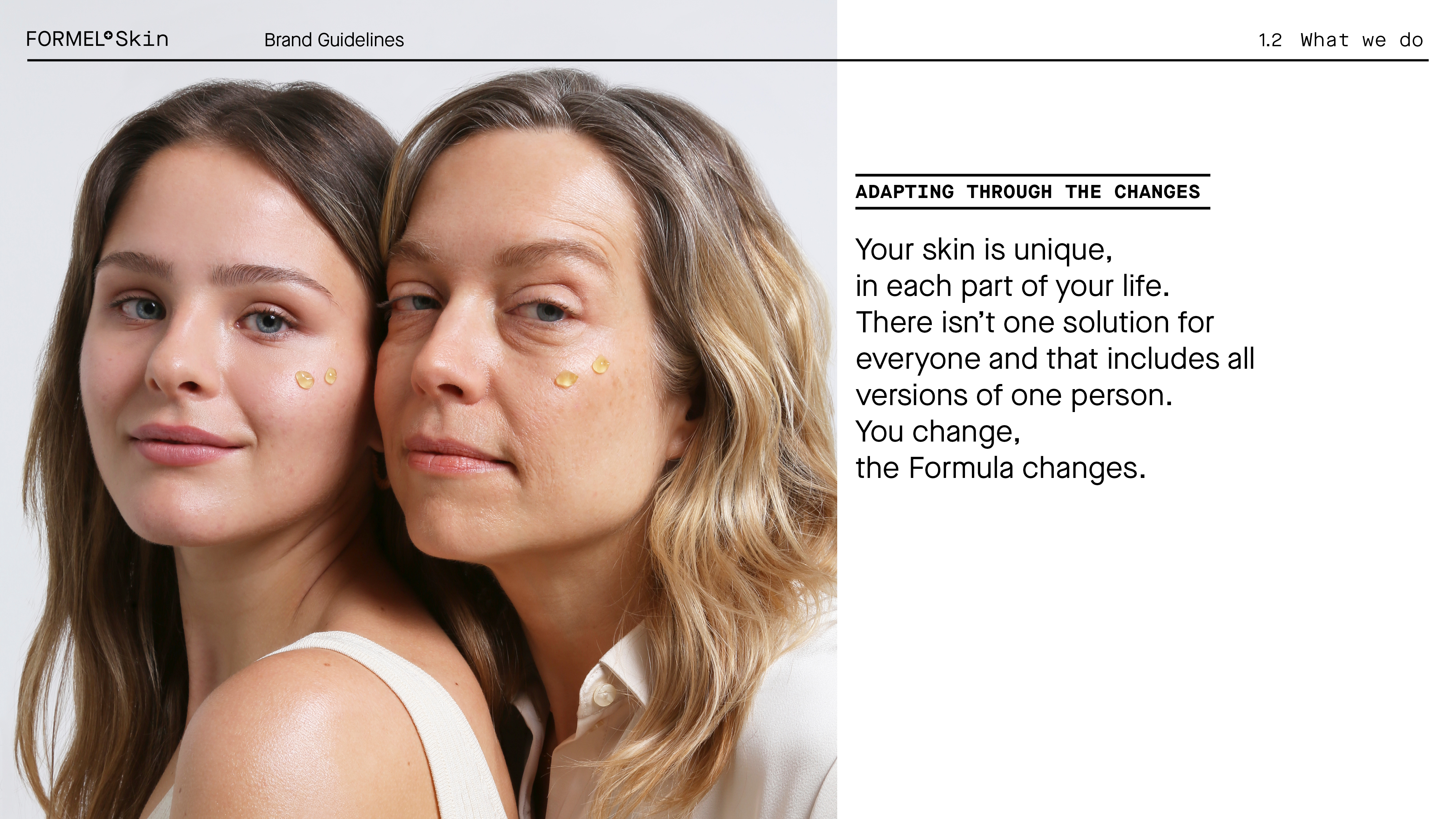
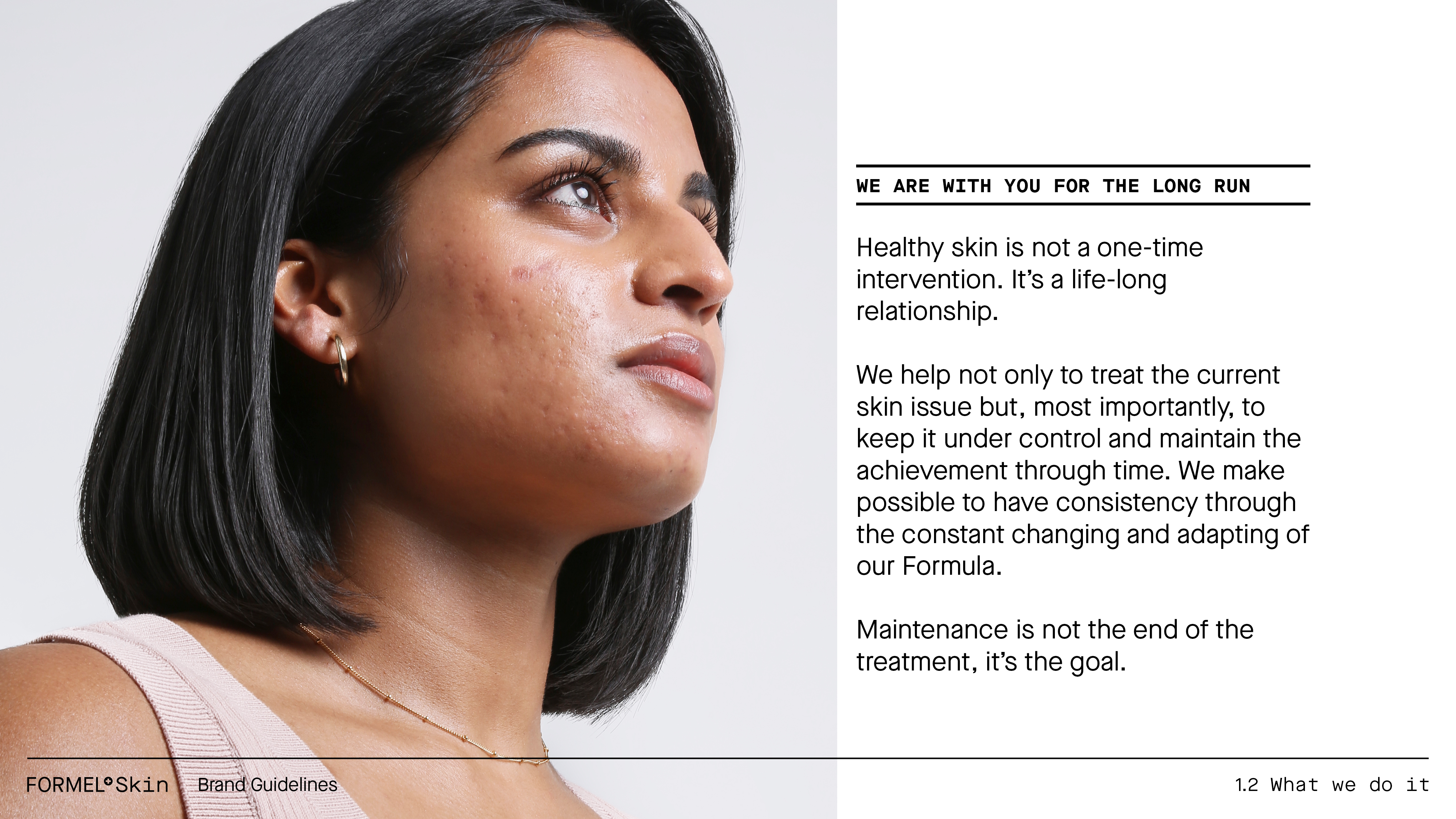
FORMEL Skin treats skin conditions with customized medical products, updated monthly through online assessments. As the skin changes, their formula changes too.
As the brand prepared to grow its product line and expand to other countries, the brand identity needed to also grow in distinctiveness and complexity.
Simplicity is a core value for the brand, as it turns the complex process of finding dermatological treatments and the right skin products into a 3 step process.
So growing in complexity should still maintain the minimalistic, precise, and scientific approach.
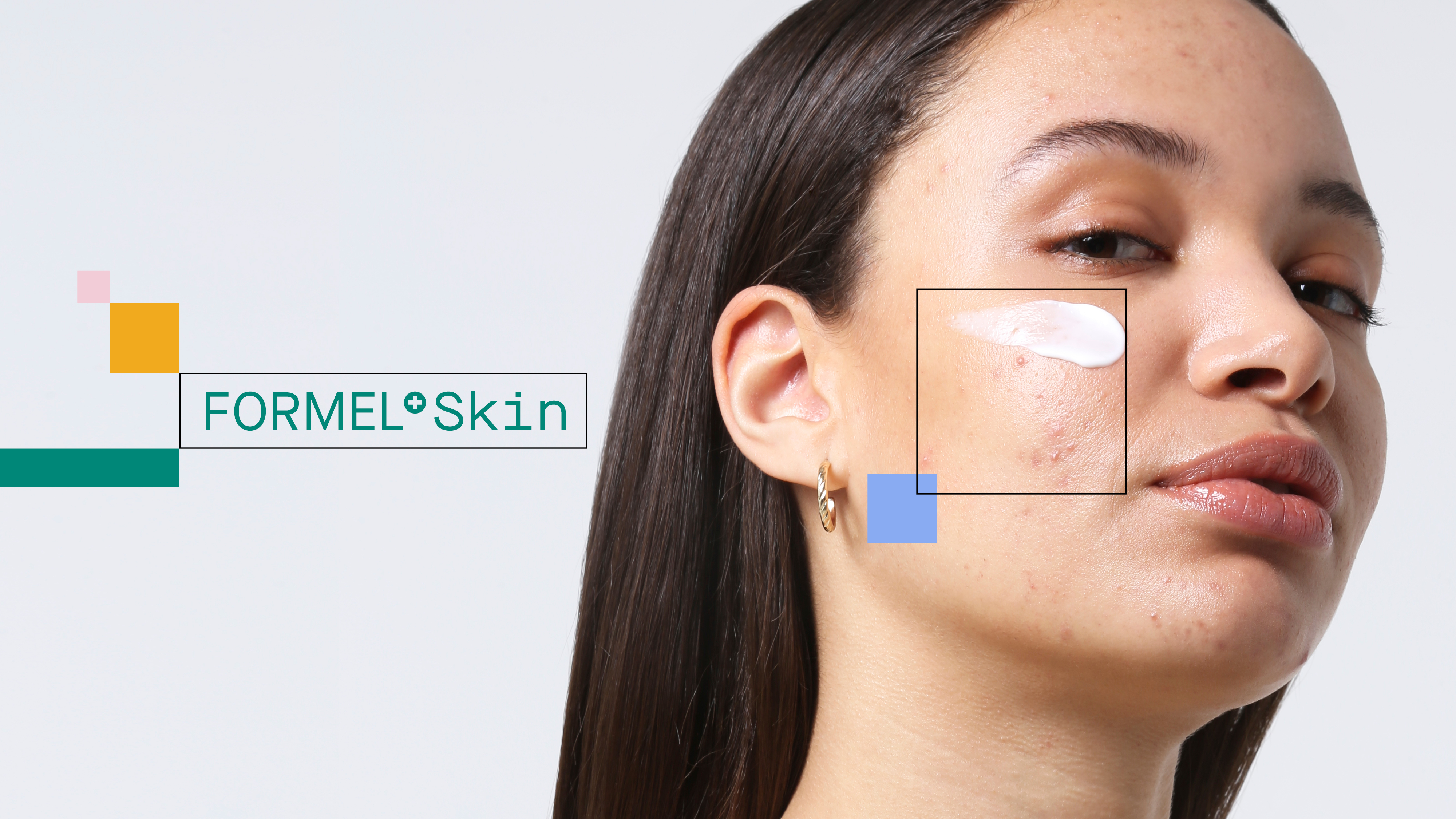
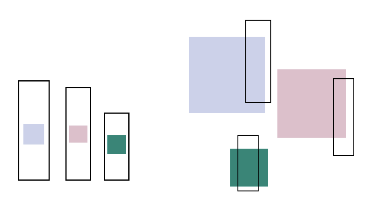


Complexity and minimalism in a modular solution:
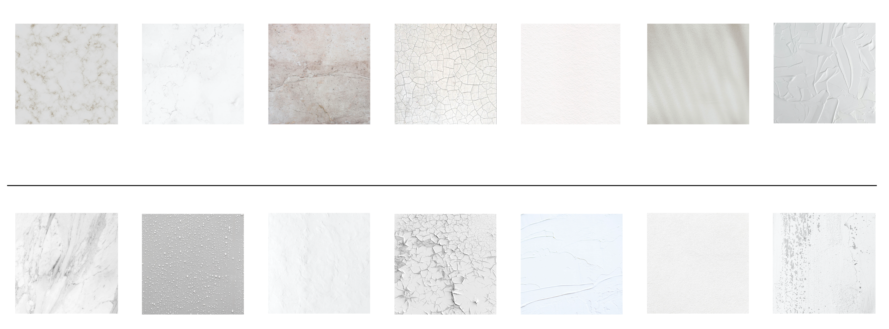
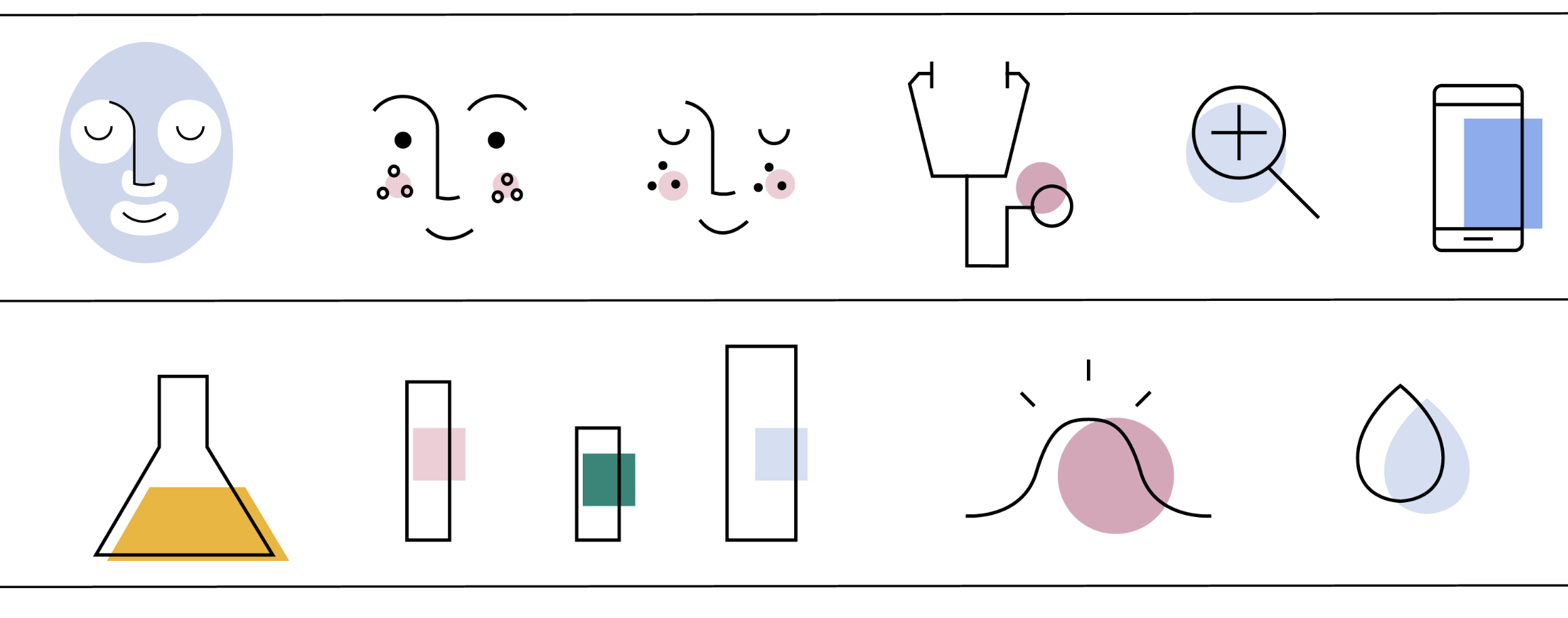
For the brand refresh, the new graphic vocabulary expanded from the existing square on the products’ labels. By making it into a modular system, heavily inspired by Mondrian, it communicated the adaptability of the treatment. When overlaid on photos it acted as a lens targeting the skin issues. Abstract textures and a secondary color pallette with cool and warm neutrals, as well as icons utilizing color displacement, completed the vocabulary needed.
The brand refresh was successfully launched together with the new product line in May 2022, which included a new People and Product photoshoot and a new Brandbook.


Localization and Business Impact:
The new Brand Book was not focused just on the visual identity but rather the positioning of the brand. It was a strategic piece for the expansion to Brazil, where the brand understanding and reception could be tested in qualitative research before the launch. Due to its clarity in positioning and differentiation, the brand could be launched with minimal adaptations in this drastically different market and culture.