ANA ASCH
![]()
PURPOSE MADE VISIBLE
Creative Direction // Brand Strategy // Visual Identity // Packaging
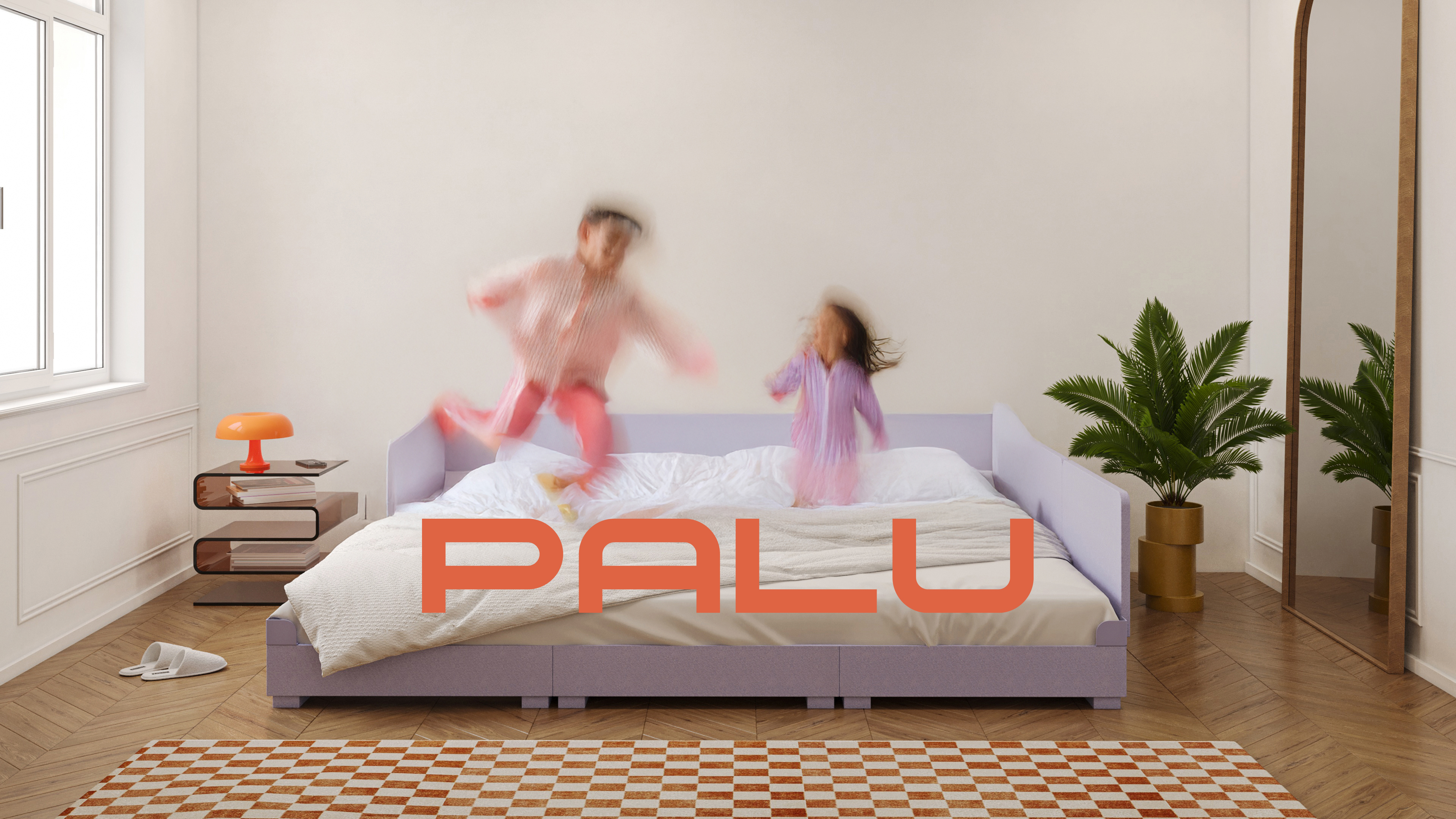

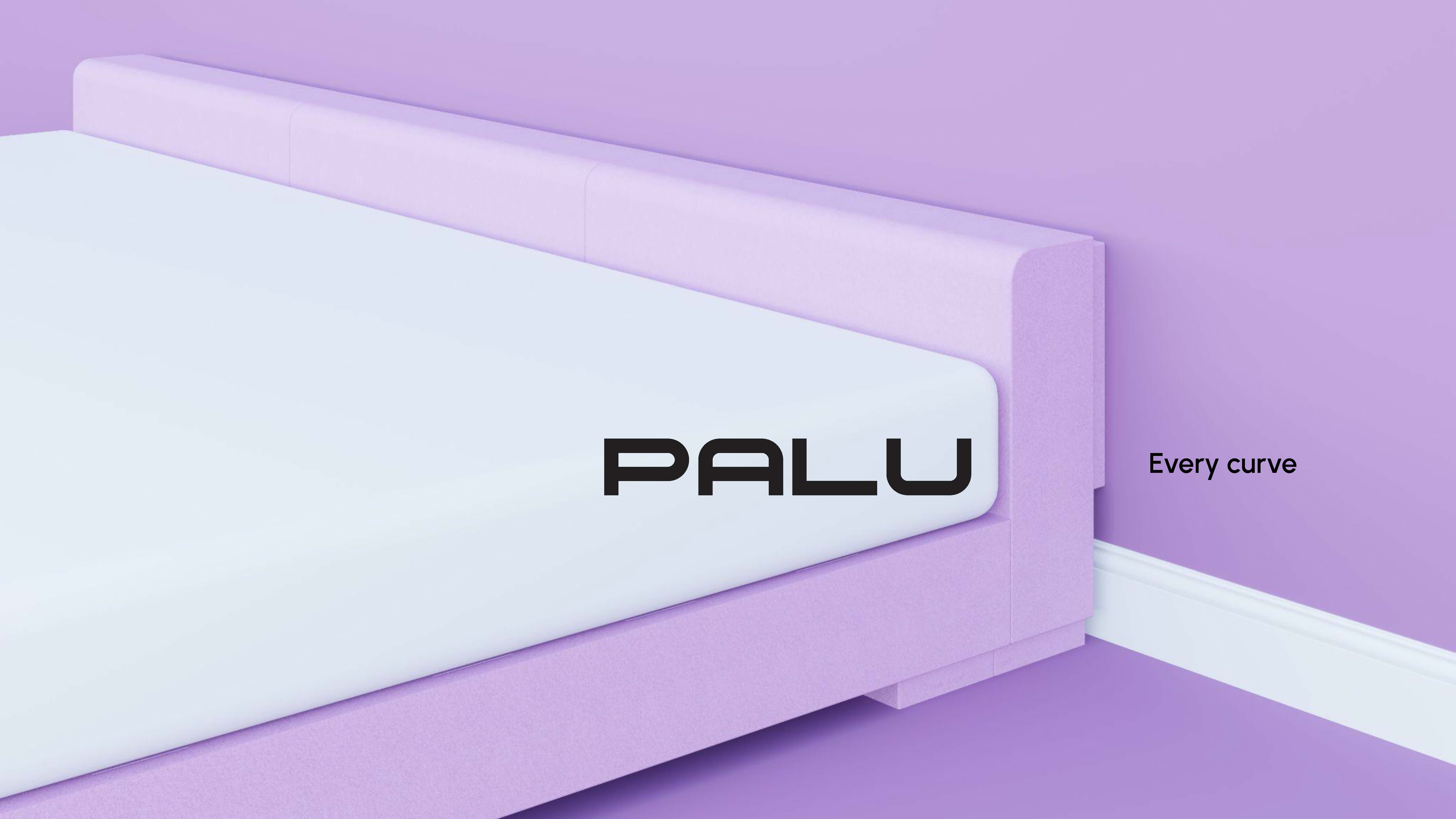
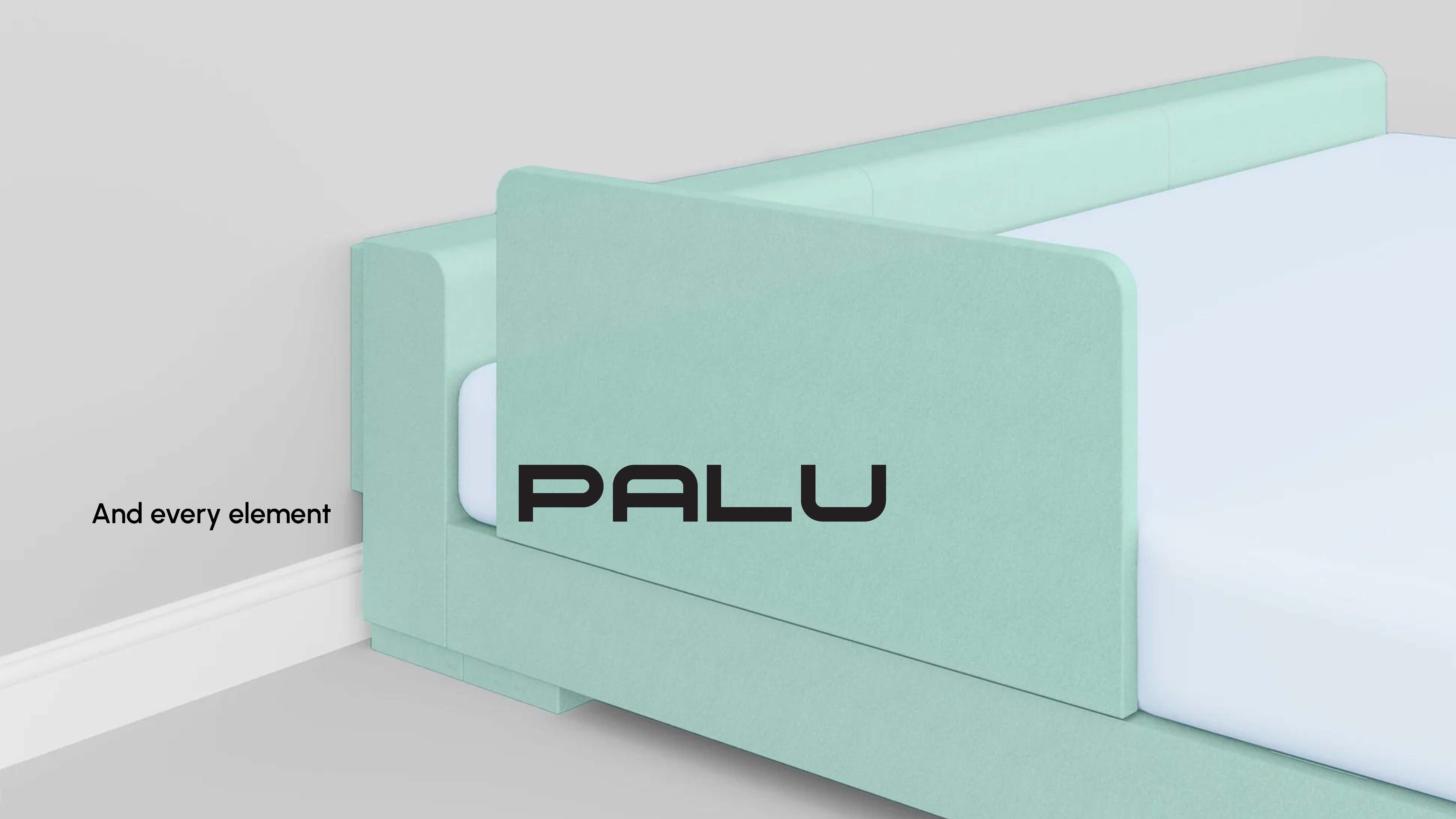
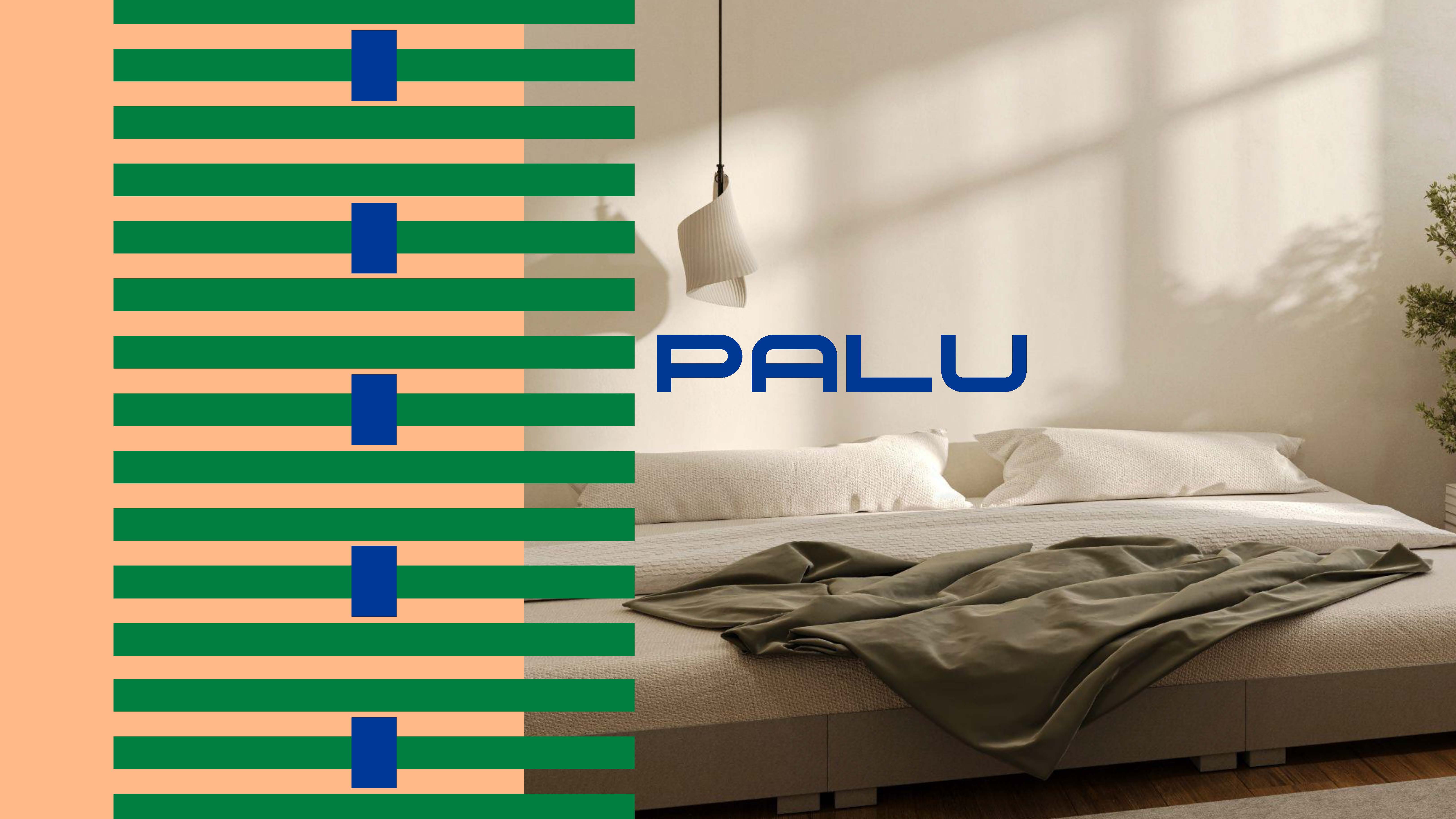
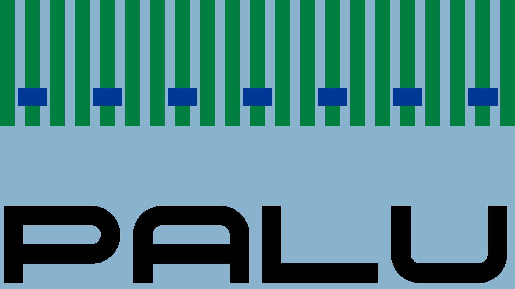
PALU
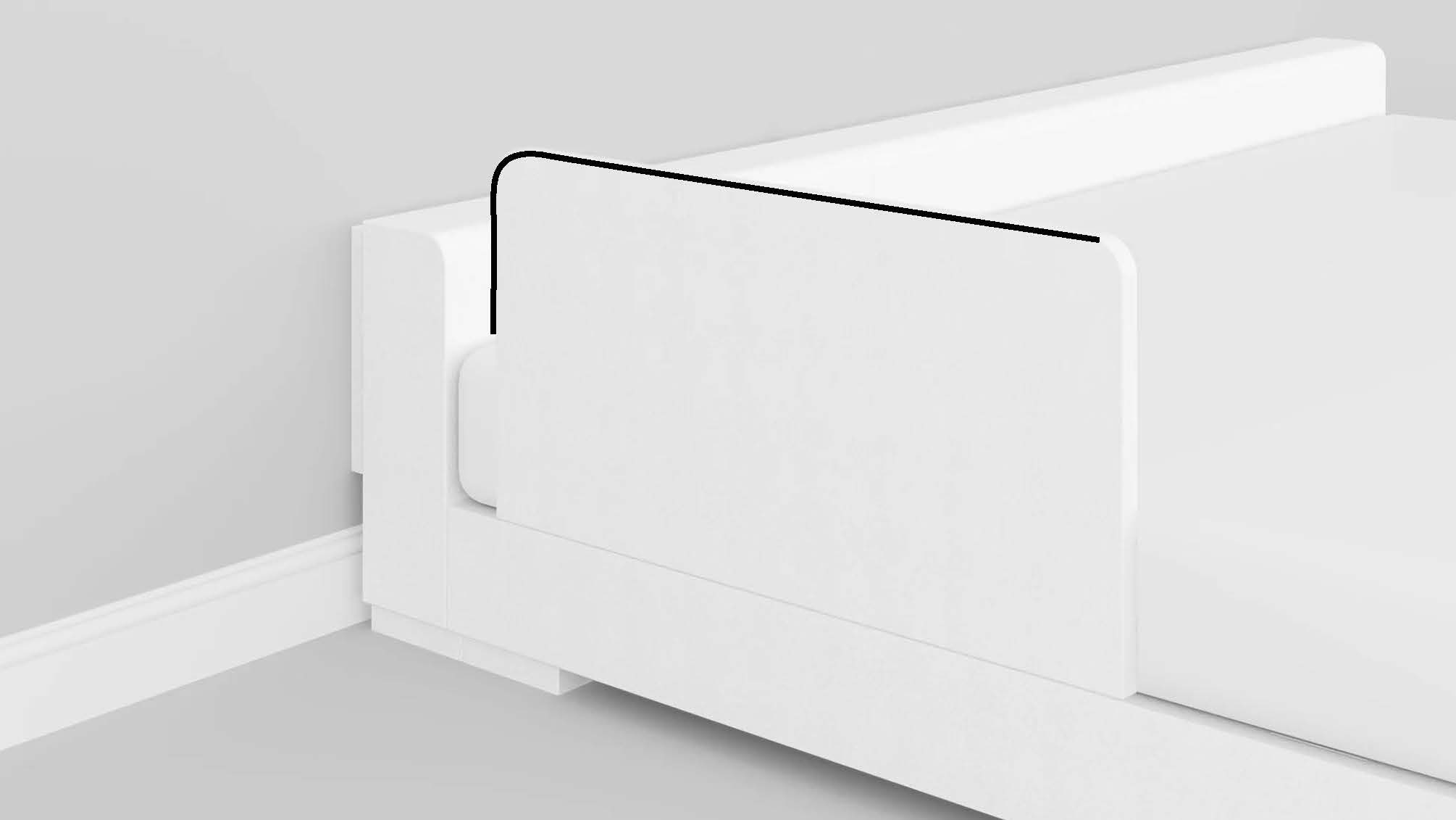
is a modular family bed that grows with your family. It is designed to transition from co-sleeping in early childhood to independent sleep, with ease. Despite a strong product concept, when PALU reached out to me they faced a positioning challenge: the brand message was unclear, the value proposition was difficult to articulate, and communication leaned too heavily on the product’s core strengths but lacked an emotional core. The founders needed a strategy to connect the emotional and the practical, how it should be understood in the market, and a visual identity that reflects its way of being.
Brand Strategy
In order to explain to their customers what makes PALU unique, first the company needed to understand it. Throught reasearch and strategy workshops with the founding team, we arrived at the understanding that PALU is modular co-sleeping system that makes connections easy. This aligns the brand’s emotional purpose with how the product works, as well as which experiences it creates. Most importantly, it provided a principle that allows the brand to grow well beyond beds: it becomes a foundation for future products, campaigns, and experiences.
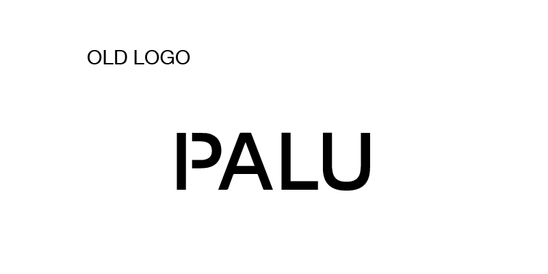
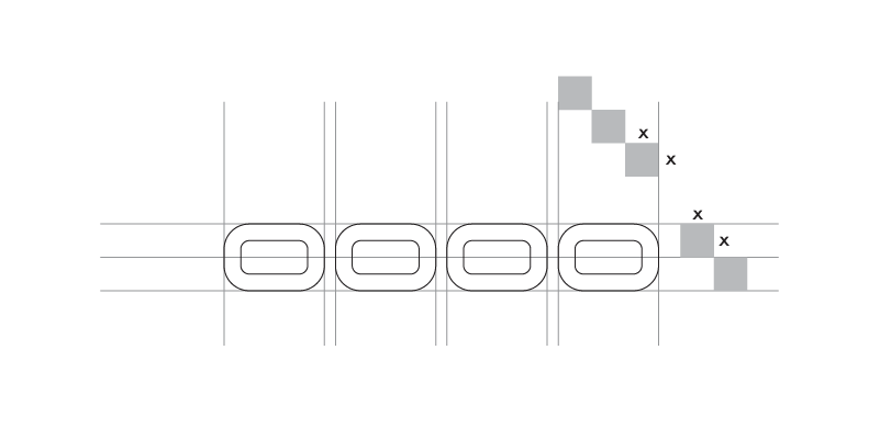

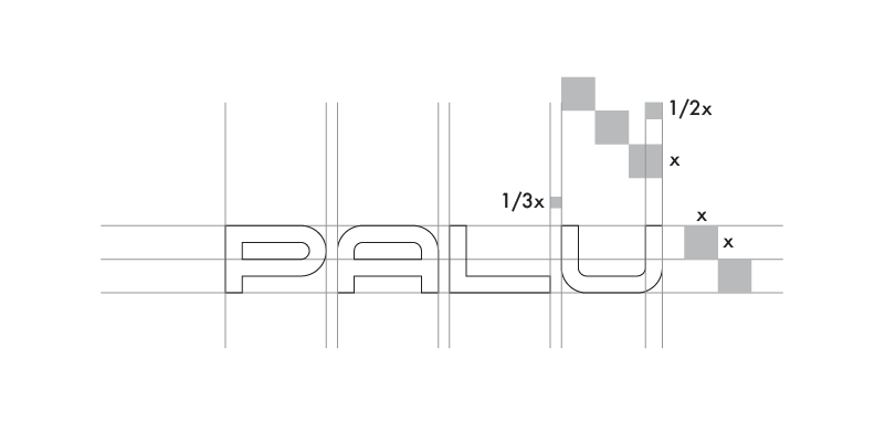
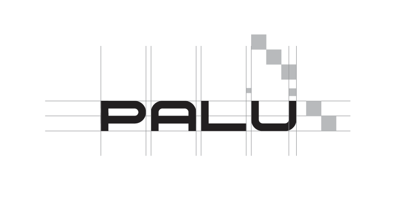
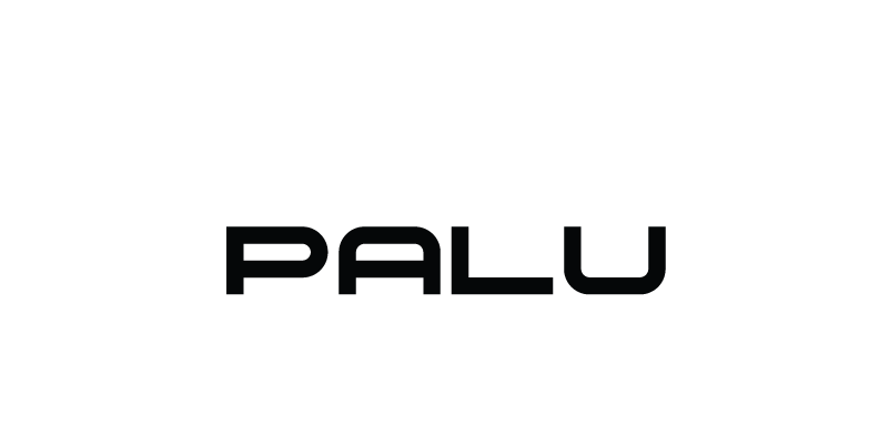


New logo and tagline
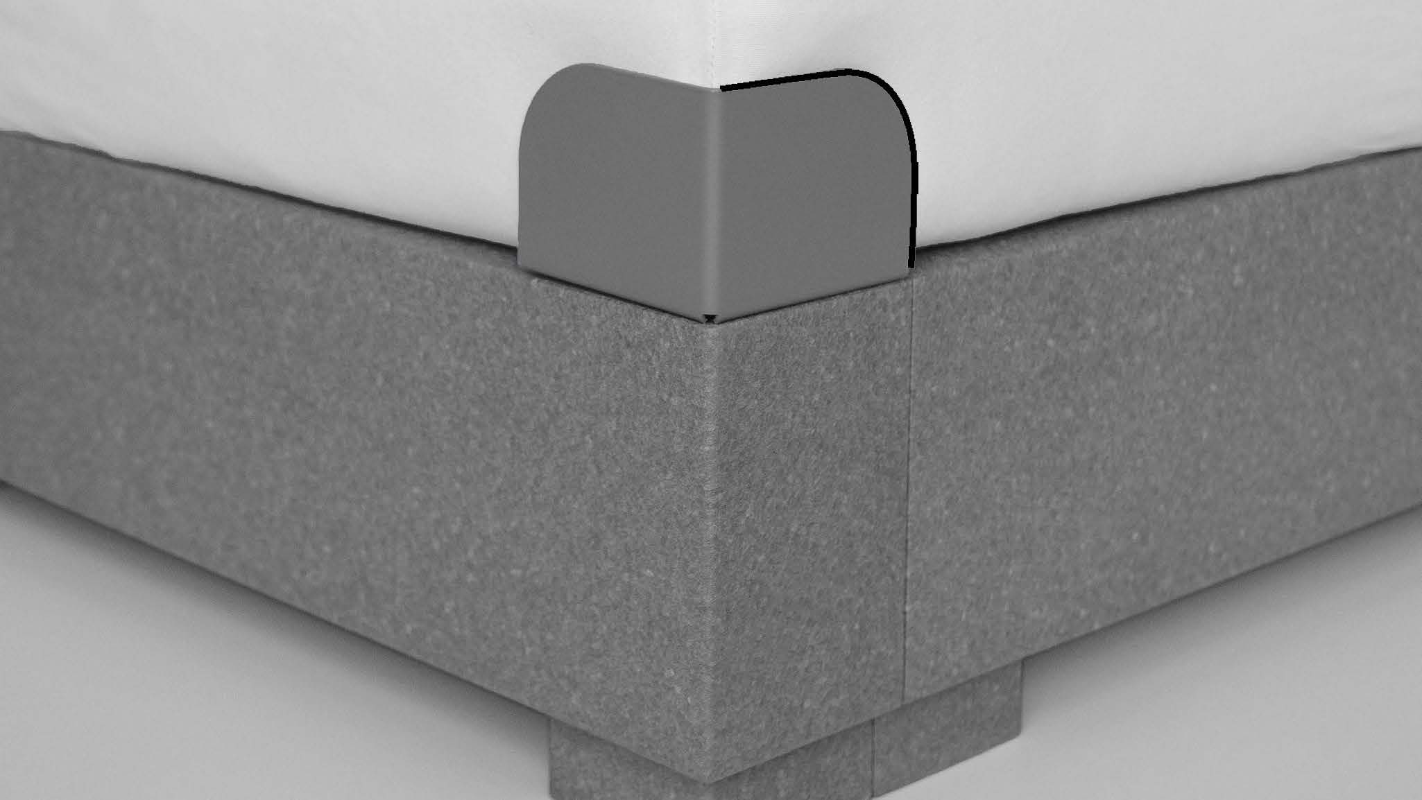
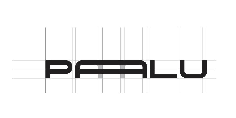
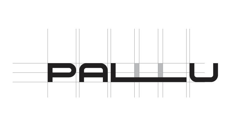
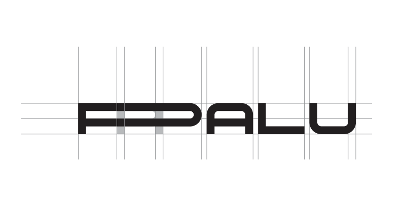
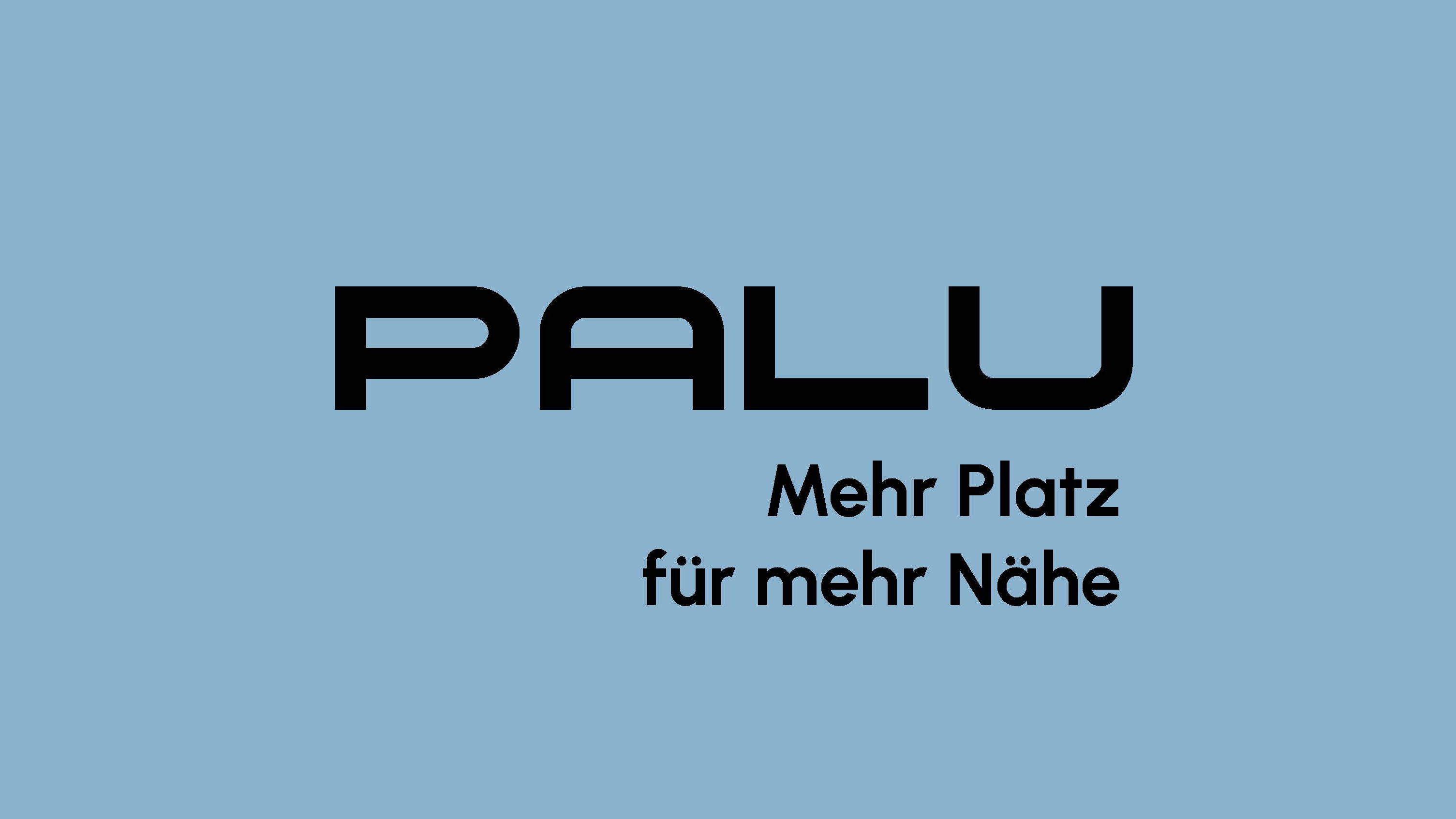
The new logo is inspired by the bed itself. Rounded corners, a solid frame, and built in classic lines, it was created from scratch in a modular grid like the bed. And like the bed, it also expands and contracts to fit what matters. This is also the idea behind the new tagline: Mehr Platz für mehr Nähe. More space for closeness, more room to grow.
A modular visual identity for a modular bed
PALU is a modern solution for modern parents. The visual expression had to convey modularity, warmth, and style in both visual elements and photography. Because PALU isn’t just for babies: it’s a long-term piece of furniture. The visuals draw inspiration from fashion photography and patterns to position it as an iconic object.
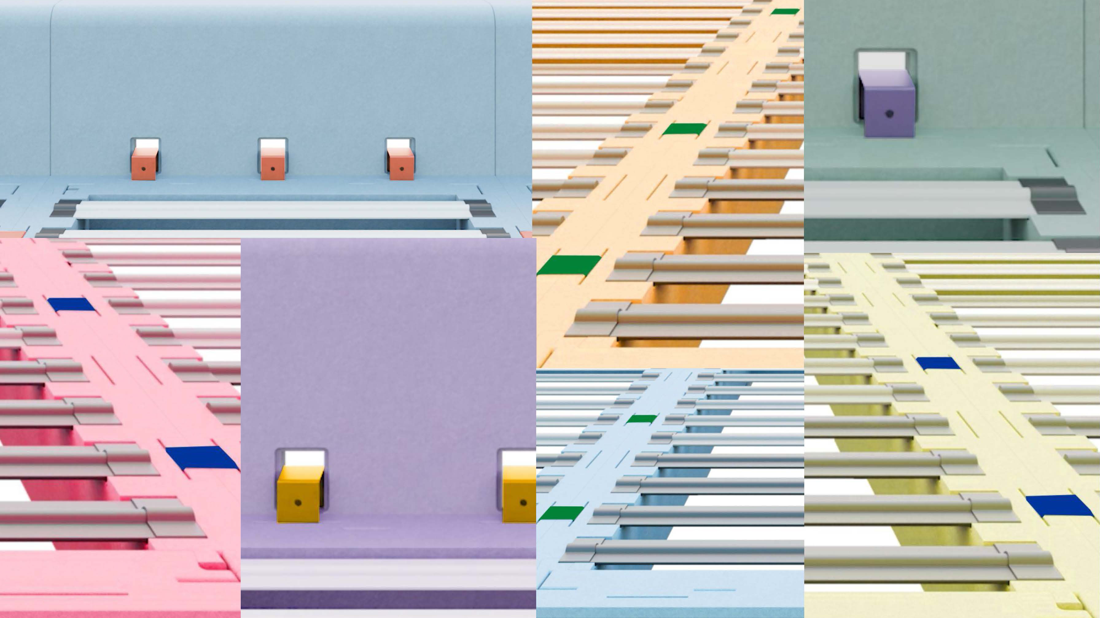
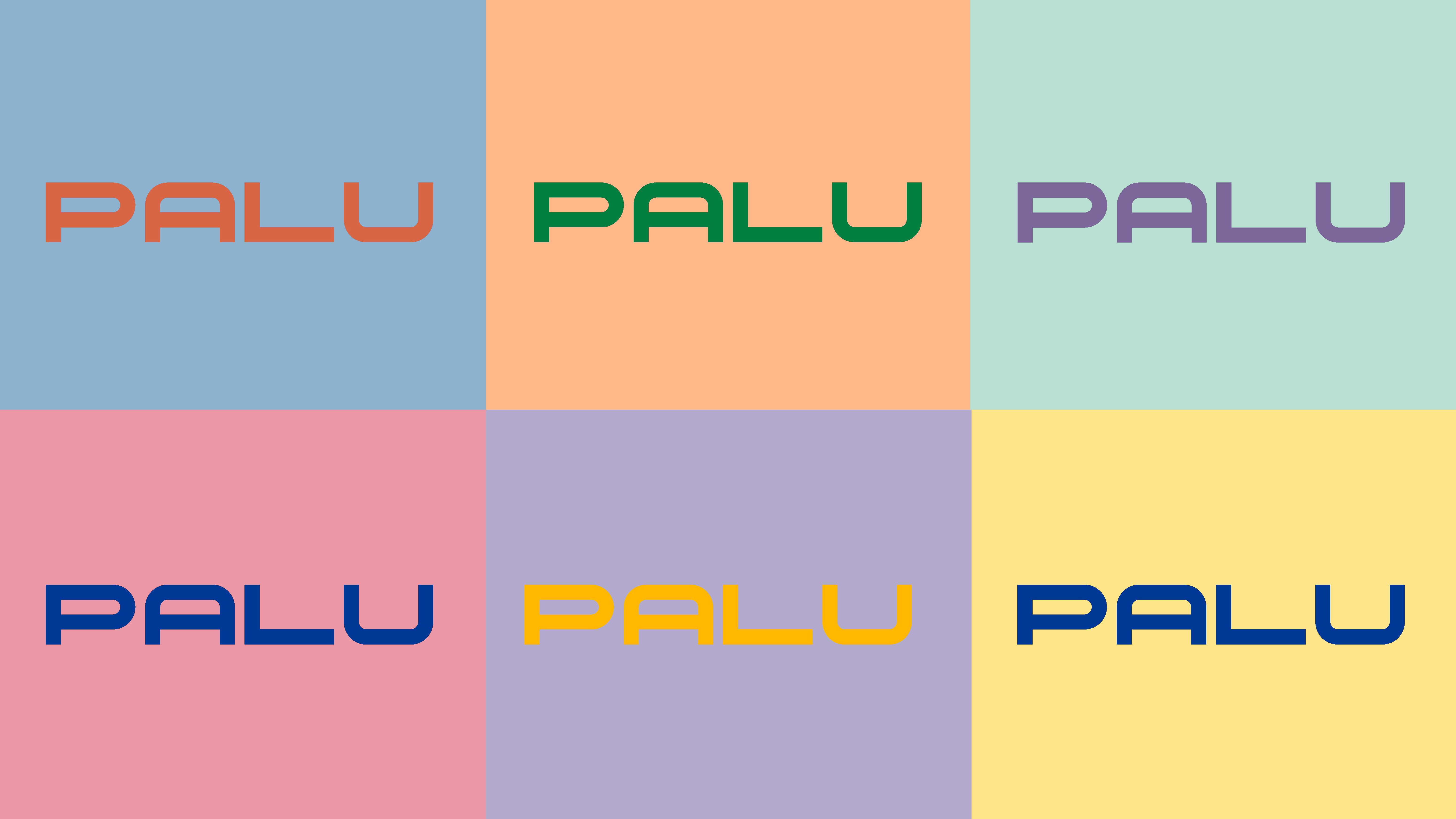
The color system comes directly from the product: the pastel tones of the PPE base contrasting with new accent colors chosen for the connector, the fundamental piece that holds the bed together.
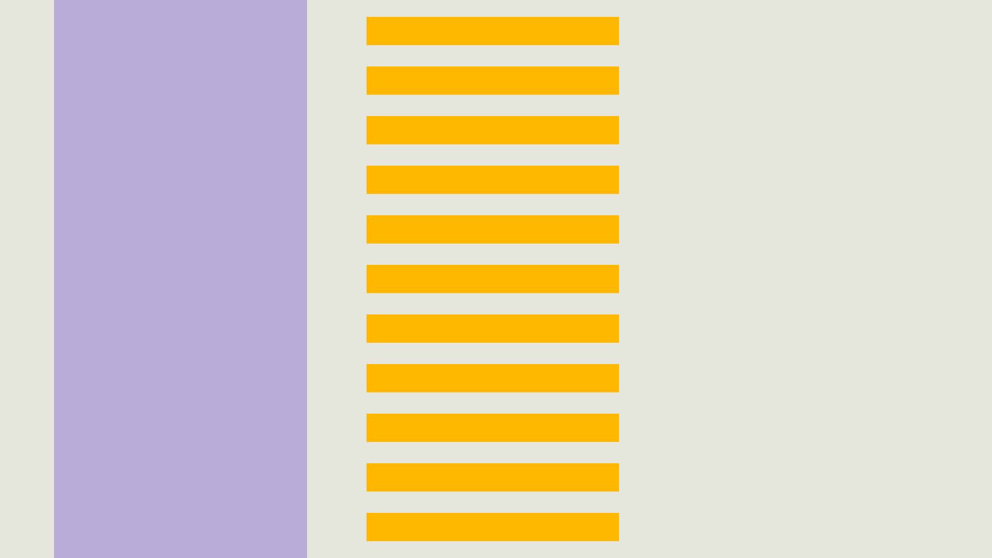
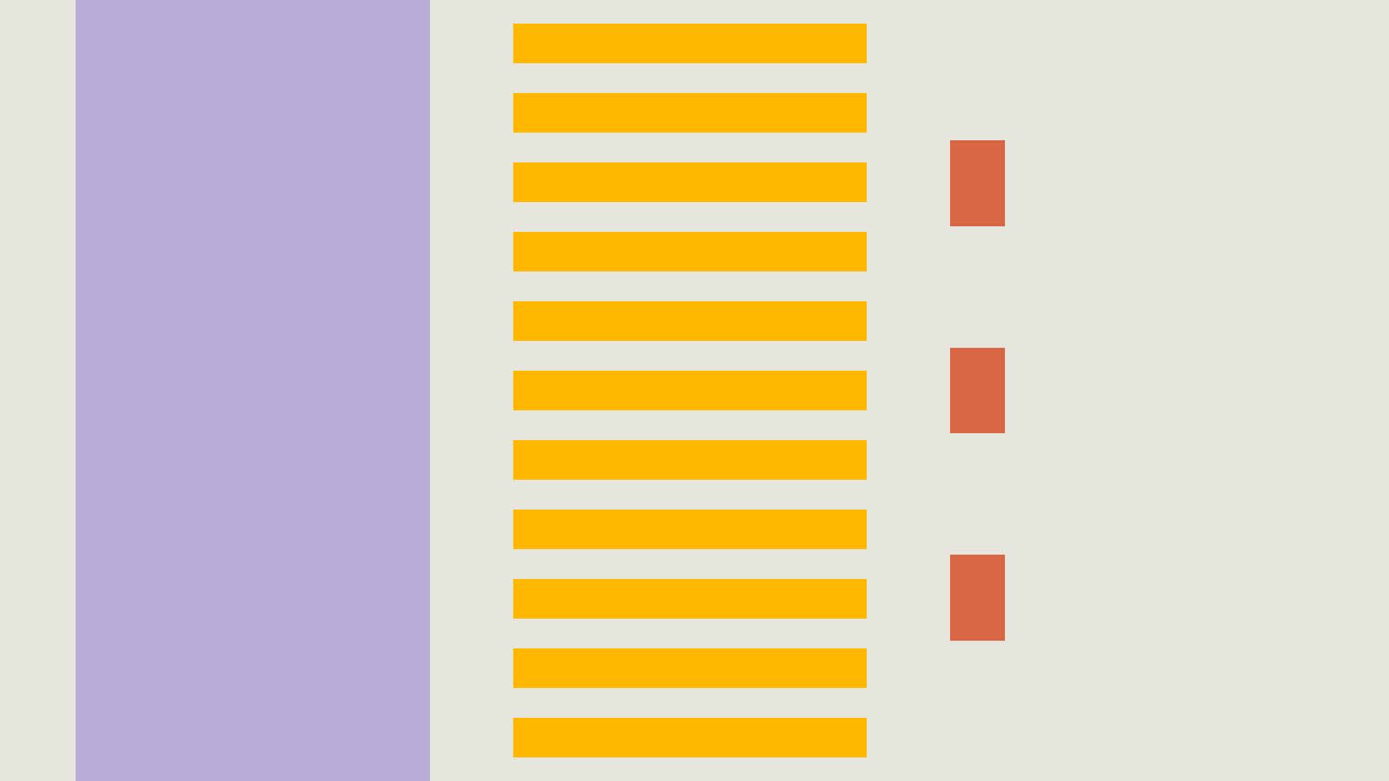
Graphic elements echo the product’s construction: the base, slats, and connector form a flexible grid system that can expand and adapt like the bed itself.


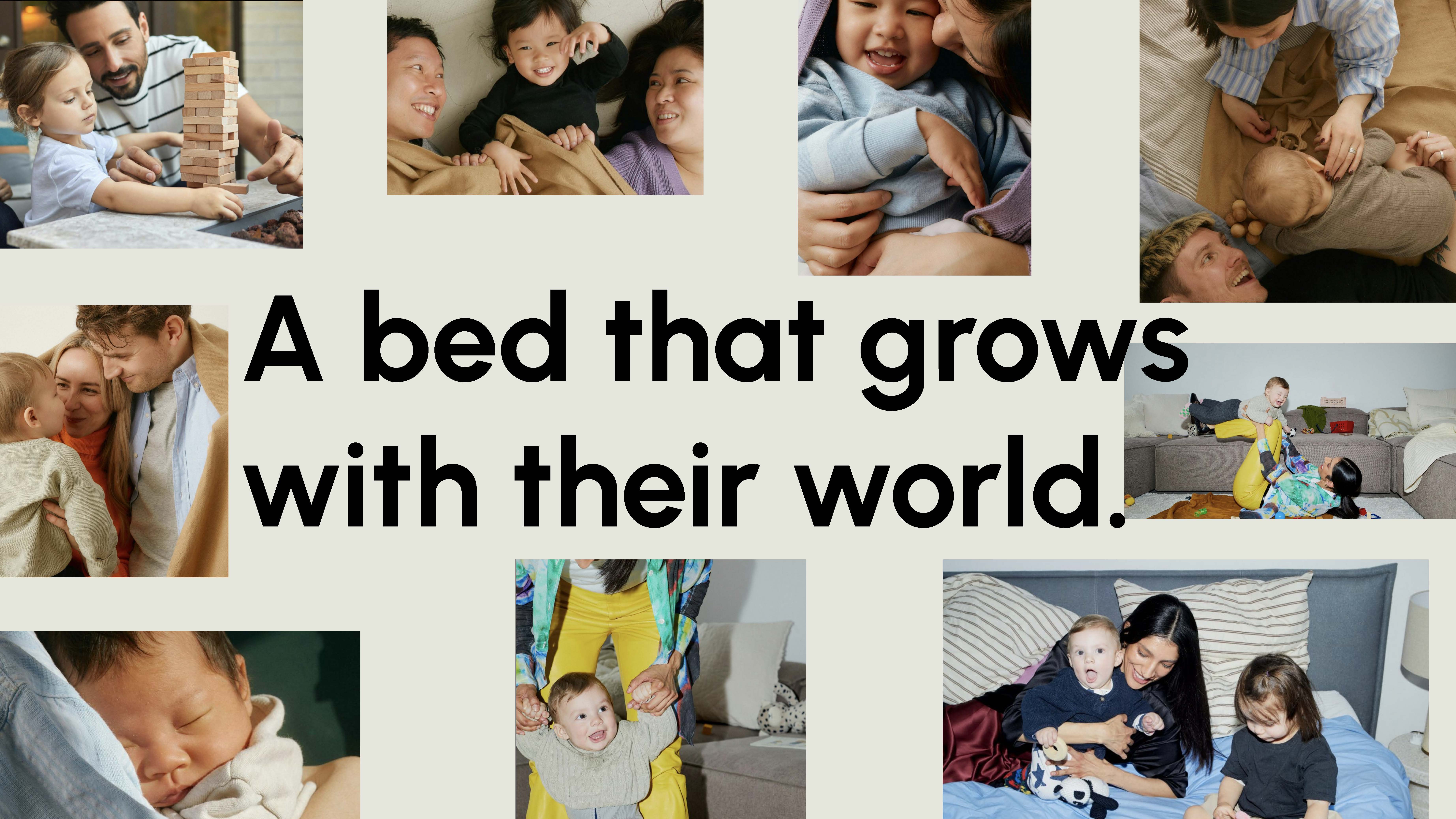
Bringing the brand to life with photography
PALU had from the start an original product with strong industrial design principles, but it was equally important to show what it’s really for: people, connection, and everyday family life. Photography humanizes the brand, making abstract values like closeness, ease, and play become real and relatable.
Taking cues from fashion editorials, the relaxed poses and stylish interior decor bring energy and personality, positioning the product as iconic. The goal isn’t to look perfect, but real. By making room for growth, play, and all the unexpected moments in between, PALU fits as the stable and simple element in the fun and chaos of family life.
_
Images rights belong to Death to Stock